Before the impact of COVID-19 turned our worlds upside down, we caught up with Stephen Taylor, associate director at AHMM, the award-winning architecture practice behind the design of Two New Bailey Square. We talked about why the design of one of New Bailey’s most iconic buildings will stand the test of time and be a trailblazer for office wellbeing, something which we will all be looking forward to returning to when we start to get back to normal.
Here’s what he had to say…
When it comes to designing buildings, architects will tell you that there are three basics to consider – structure, services and skin. It’s as simple as that. However, in reality we know that design can go as far as the imagination (and the budget) will allow, meaning that the realms of possibility are endless.
Over the years, we’ve seen design trends come and go, so how do we go about creating something that will stand the test of time? Well, we go back to those three basics of structure, services and skin because that’s all you really need, we consider the rest to be superfluous and anything that can be easily thrown away will date quickly. This doesn’t mean a building should be boring though, far from it. Over the past 10 years, occupiers are increasingly moving away from forgettable ‘vanilla’ office buildings, they want personality and that should come from the building’s core – that’s where we can really get creative.
When we first started thinking about the design for Two New Bailey Square, it wasn’t just another office project, we are constantly thinking about how we can make the next best workplace. For us, it’s about doing more with less.
Working closely with our client, The English Cities Fund, we understood its vision for the wider Salford Central masterplan, to bring forward schemes that tap into the rich tapestry that is the history of Salford, with its aspirations to drive investment, skills and growth into the heart of the city. This, coupled with the strategy to create buildings that are adaptable for the future with wellbeing in mind, gave us the mandate to create something truly special with Two New Bailey Square.
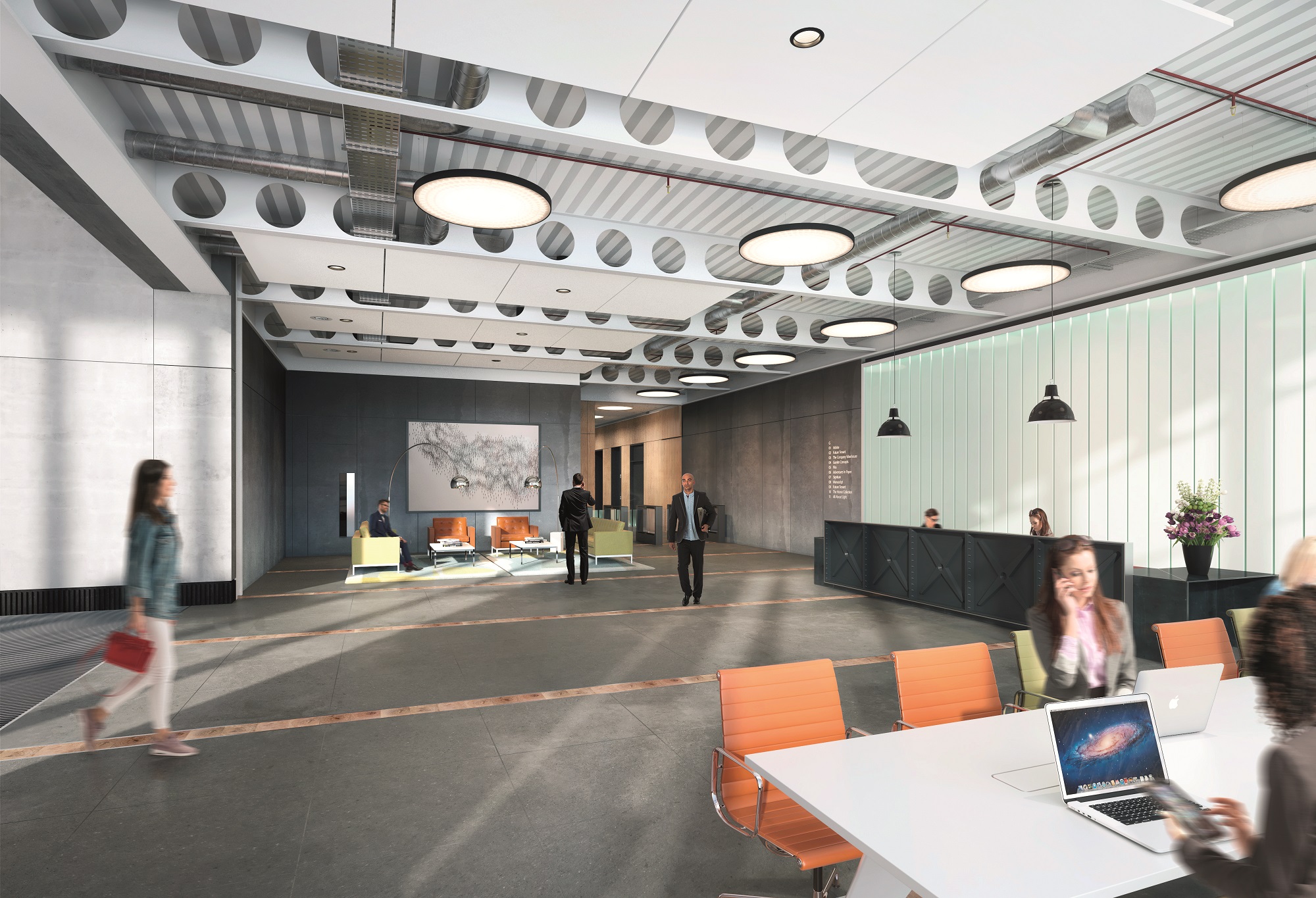
Tying in with the history of the area, the New Bailey scheme picks up on the nuances of warehouses and industrial buildings – buildings that typically have less going on design-wise but are a hive of activity inside. We’ve definitely played on that with Two New Bailey Square, focusing heavily on the people that will come to use the building and their wellbeing, rather than shiny bells and whistles.
Wellbeing
Health and fitness have never been more important in office building design and creating more amenities to service occupiers’ needs. One such component is cycle storage provision; it is vital for workplace wellbeing these days as the CEO of a company is just as likely to come to work on a bike as anyone else. At Two New Bailey Square, cyclists enter via the main entrance, it’s such an integral part of life now that we didn’t want the facilities to be hidden at the back, behind the bin store. It’s a front of house function and there are shower and drying facilities, so our commuters can start the working day feeling fresh.
We have also created characterful floorplates and shared roof terraces for people to escape to when they fancy some fresh air and a change of scene. The floor to ceiling height and balconies on each floor provide more breakout space and create a space that workers are really attracted to. The amount of daylight that’s allowed into the building is also key, in the office space at Two, there is a sense of wellness and lots of daylight is streamed in but only where needed.
The staircase is intentionally open, not hidden away in the central core, providing interconnecting stairwells for tenants who are spread across multiple floors and to encourage human collisions. This open plan approach allows for tenants to be more interactive on the stairwell; they are brightly coloured and well lit, so tenants are encouraged to save the lift and use their legs instead. Informal meetings can even take place on the stairs, encouraging further human interaction. It’s quite simple in its design but it was really important to get the stairs right from the very beginning for this reason.
With design trends continuously evolving, who knows what the next big thing will be in five, ten, 20 years’ time but one thing we do know is that a focus on employee wellbeing is here to stay. The structure, services and skin that makes up Two New Bailey Square will do just that while also having a striking impact on the city’s streetscape.


